


ROLE
Lead designer
ROLE
Lead designer
ROLE
Lead designer
ROLE
Lead designer
SKILLS
Visual design, interaction design, prototyping, user flows
SKILLS
Visual design, interaction design, prototyping, user flows
SKILLS
Visual design, interaction design, prototyping, user flows
SKILLS
Visual design, interaction design, prototyping, user flows
TOOLS
Figma, Instagram, Google Forms + Sheets
TOOLS
Figma, Instagram, Google Forms + Sheets
TOOLS
Figma, Instagram, Google Forms + Sheets
TOOLS
Figma, Instagram, Google Forms + Sheets
TIMELINE
3 months
TIMELINE
3 months
TIMELINE
3 months
TIMELINE
3 months
OVERVIEW
OVERVIEW
OVERVIEW
OVERVIEW
Motoring Coffee is a relaxed and vibey coffee house in Santa Monica that’s home to vintage automobiles, F1 race cars, and good coffee. Opened in 2023, this location is full of passionate enthusiasts, each one with unique style and traits. They’ve opened a second location in SF in 2024, but there has still not been any notable updates to their website, to the dismay of many coffee lovers out there.
I redesigned how users interact with the website and coffee shop, addressing user needs and frustrations by increasing usability on the website with an online ordering feature, events calendar, and broadening the preexisting site map and user flows.
The problem
The problem
The problem
The problem
Motoring Coffee fans aren’t using the website.
Motoring Coffee fans aren’t using the website.
Motoring Coffee fans aren’t using the website.
Motoring Coffee fans aren’t using the website.
These users are loyal to the brand, but don’t see much use to the website with its current form.
These users are loyal to the brand, but don’t see much use to the website with its current form.
These users are loyal to the brand, but don’t see much use to the website with its current form.
These users are loyal to the brand, but don’t see much use to the website with its current form.
The current website* + audits
The current website* + audits
The current website* + audits
The current website* + audits
More of an image gallery than functioning website, exploring these pages leads users to images of the coffee shops, the address, and a small merch shop. They have a menu available as well, but you won’t find that unless you know to type menu into the search bar behind the (.coffee/), or click to view location information and scroll all the way down. That’s all there is to the functionality.
More of an image gallery than functioning website, exploring these pages leads users to images of the coffee shops, the address, and a small merch shop. They have a menu available as well, but you won’t find that unless you know to type menu into the search bar behind the (.coffee/), or click to view location information and scroll all the way down. That’s all there is to the functionality.
More of an image gallery than functioning website, exploring these pages leads users to images of the coffee shops, the address, and a small merch shop. They have a menu available as well, but you won’t find that unless you know to type menu into the search bar behind the (.coffee/), or click to view location information and scroll all the way down. That’s all there is to the functionality.
More of an image gallery than functioning website, exploring these pages leads users to images of the coffee shops, the address, and a small merch shop. They have a menu available as well, but you won’t find that unless you know to type menu into the search bar behind the (.coffee/), or click to view location information and scroll all the way down. That’s all there is to the functionality.


*this information has been updated to reflect their updated 2024 website.
*this information has been updated to reflect their updated 2024 website.
*this information has been updated to reflect their updated 2024 website.
*this information has been updated to reflect their updated 2024 website.
Competitive Analysis
Competitive Analysis
Competitive Analysis
Competitive Analysis
A SWOT and competitive analysis were done on 3 direct competitors, and 6 indirect competitors. Through these analyses, I discovered that a majority of these coffee shop websites had 2 main things in common:
A SWOT and competitive analysis were done on 3 direct competitors, and 6 indirect competitors. Through these analyses, I discovered that a majority of these coffee shop websites had 2 main things in common:
A SWOT and competitive analysis were done on 3 direct competitors, and 6 indirect competitors. Through these analyses, I discovered that a majority of these coffee shop websites had 2 main things in common:
A SWOT and competitive analysis were done on 3 direct competitors, and 6 indirect competitors. Through these analyses, I discovered that a majority of these coffee shop websites had 2 main things in common:
Order ahead option
All of the direct competitors had some sort of online order/ order ahead option for food and drinks. This counts both 3rd party ordering systems (ie Toast, DoorDash) as well as a coffee shop's own ordering system within the website.
Order ahead option
All of the direct competitors had some sort of online order/ order ahead option for food and drinks. This counts both 3rd party ordering systems (ie Toast, DoorDash) as well as a coffee shop's own ordering system within the website.
Order ahead option
All of the direct competitors had some sort of online order/ order ahead option for food and drinks. This counts both 3rd party ordering systems (ie Toast, DoorDash) as well as a coffee shop's own ordering system within the website.
Order ahead option
All of the direct competitors had some sort of online order/ order ahead option for food and drinks. This counts both 3rd party ordering systems (ie Toast, DoorDash) as well as a coffee shop's own ordering system within the website.
Item pictures
6 out of 9 of the competitors had some sort of item image listing, whether it be from an order option or separate on their website . A majority of these websites show users what food and/or drink options they have, and images so users know exactly what they're going to get.
Item pictures
6 out of 9 of the competitors had some sort of item image listing, whether it be from an order option or separate on their website . A majority of these websites show users what food and/or drink options they have, and images so users know exactly what they're going to get.
Item pictures
6 out of 9 of the competitors had some sort of item image listing, whether it be from an order option or separate on their website . A majority of these websites show users what food and/or drink options they have, and images so users know exactly what they're going to get.
Item pictures
6 out of 9 of the competitors had some sort of item image listing, whether it be from an order option or separate on their website . A majority of these websites show users what food and/or drink options they have, and images so users know exactly what they're going to get.


User research insights
User research insights
User research insights
User research insights
I conducted user interviews as well as collected survey results, and there were a 2 key problem statements that showed up.
I conducted user interviews as well as collected survey results, and there were a 2 key problem statements that showed up.
I conducted user interviews as well as collected survey results, and there were a 2 key problem statements that showed up.
I conducted user interviews as well as collected survey results, and there were a 2 key problem statements that showed up.
Don't know what to expect
Don't know what to expect
Don't know what to expect
Don't know what to expect
Users aren’t able to see what MC offers for drinks, events, or shop space, and many stated that they would use the website if it had useful information. This can deter newer users from visiting the coffee shop.
Users aren’t able to see what MC offers for drinks, events, or shop space, and many stated that they would use the website if it had useful information. This can deter newer users from visiting the coffee shop.
Users aren’t able to see what MC offers for drinks, events, or shop space, and many stated that they would use the website if it had useful information. This can deter newer users from visiting the coffee shop.
Users aren’t able to see what MC offers for drinks, events, or shop space, and many stated that they would use the website if it had useful information. This can deter newer users from visiting the coffee shop.
Limiting and invisible
Limiting and invisible
Limiting and invisible
Limiting and invisible
Users stated that they use coffee shop websites to place orders, view the menu, and look for store information amongst other tasks. Right now, only one of those options are readily available.
Users stated that they use coffee shop websites to place orders, view the menu, and look for store information amongst other tasks. Right now, only one of those options are readily available.
Users stated that they use coffee shop websites to place orders, view the menu, and look for store information amongst other tasks. Right now, only one of those options are readily available.
Users stated that they use coffee shop websites to place orders, view the menu, and look for store information amongst other tasks. Right now, only one of those options are readily available.
Proposed flows
Proposed flows
Proposed flows
Proposed flows
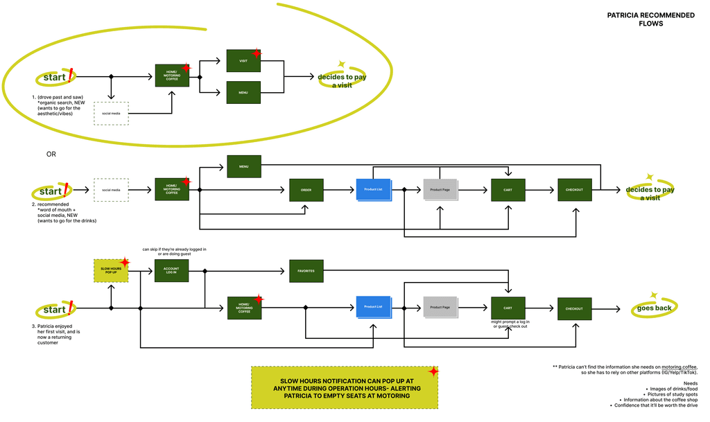
Two flows were created to account for the two types of users shown through user research. One flow keyed in on the products offered by Motoring Coffee, and the ordering process (left). The second flow looked at the interactivity of the store front, as well as details about events, hours, and additional information (right). These flows would offer users more use of the website, and bring them back to Motoring Coffee.
Two flows were created to account for the two types of users shown through user research. One flow keyed in on the products offered by Motoring Coffee, and the ordering process (left). The second flow looked at the interactivity of the store front, as well as details about events, hours, and additional information (right). These flows would offer users more use of the website, and bring them back to Motoring Coffee.
Two flows were created to account for the two types of users shown through user research. One flow keyed in on the products offered by Motoring Coffee, and the ordering process (left). The second flow looked at the interactivity of the store front, as well as details about events, hours, and additional information (right). These flows would offer users more use of the website, and bring them back to Motoring Coffee.
Two flows were created to account for the two types of users shown through user research. One flow keyed in on the products offered by Motoring Coffee, and the ordering process (left). The second flow looked at the interactivity of the store front, as well as details about events, hours, and additional information (right). These flows would offer users more use of the website, and bring them back to Motoring Coffee.


Wireframes
Wireframes
Wireframes
Wireframes
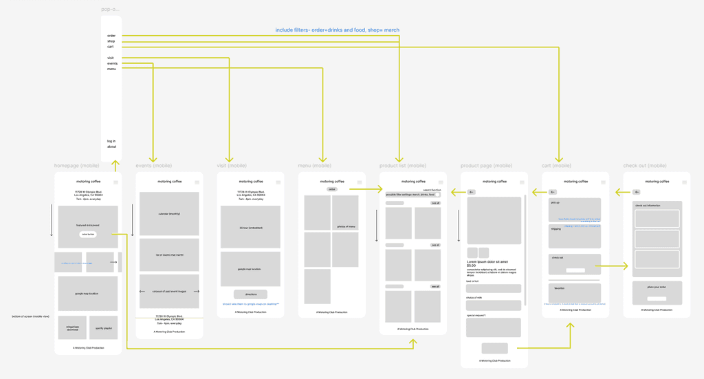
I spent most of my time revising layouts for both desktop and mobile, adding features that allowed for users to interact with and explore the website, making it useful to their needs. Although the initial iteration did introduce all the new components, it strayed too far from the branding of Motoring Coffee, and there wasn’t clear hierarchy.
I spent most of my time revising layouts for both desktop and mobile, adding features that allowed for users to interact with and explore the website, making it useful to their needs. Although the initial iteration did introduce all the new components, it strayed too far from the branding of Motoring Coffee, and there wasn’t clear hierarchy.
I spent most of my time revising layouts for both desktop and mobile, adding features that allowed for users to interact with and explore the website, making it useful to their needs. Although the initial iteration did introduce all the new components, it strayed too far from the branding of Motoring Coffee, and there wasn’t clear hierarchy.
I spent most of my time revising layouts for both desktop and mobile, adding features that allowed for users to interact with and explore the website, making it useful to their needs. Although the initial iteration did introduce all the new components, it strayed too far from the branding of Motoring Coffee, and there wasn’t clear hierarchy.
Iteration 1
Iteration 1
Iteration 1
Iteration 1




Iteration 2
Iteration 2
Iteration 2
Iteration 2


The Solution- A website worth keeping around
The Solution-
A website worth keeping around
The Solution- A website worth keeping around
The Solution-
A website worth keeping around
The final design focused on enhancing the existing website with new features without taking away from Motoring Coffee’s branding.
The final design focused on enhancing the existing website with new features without taking away from Motoring Coffee’s branding.
The final design focused on enhancing the existing website with new features without taking away from Motoring Coffee’s branding.
Online Ordering
Being able to order online to pick up ahead of time allows users to save time on ordering, especially when things get busy.
This system also acts as a product showcase, where incoming users can see exactly what drinks Motoring Coffee has without needing to go on an entirely different app like Yelp or Beli.


Events
Users can click into the ‘events’ page, and view all the events for the year. This is a key feature for users who want to interact more with like-minded individuals.
This also effectively reduces cognitive load for users looking everywhere for coffee and car events that they can attend.
Events
Users can click into the ‘events’ page, and view all the events for the year. This is a key feature for users who want to interact more with like-minded individuals.
This also effectively reduces cognitive load for users looking everywhere for coffee and car events that they can attend.
Events
Users can click into the ‘events’ page, and view all the events for the year. This is a key feature for users who want to interact more with like-minded individuals.
This also effectively reduces cognitive load for users looking everywhere for coffee and car events that they can attend.
Events
Users can click into the ‘events’ page, and view all the events for the year. This is a key feature for users who want to interact more with like-minded individuals.
This also effectively reduces cognitive load for users looking everywhere for coffee and car events that they can attend.


Virtual Tour
For the newcomers that aren’t sure whether or not they want to visit a coffee shop, or want to scope out the seating situation before committing to the 30 minute drive across LA, the virtual tour addresses those concerns.
Users are able to walk through the coffee shop through a 3D tour, so they can confidently gauge whether or not to leave their charging cables at home.


The Solution- Continued
The Solution- Continued
The Solution- Continued
The Solution- Continued
These designs were also finalized in a desktop format, as many users either access the website from home on their computers, or out and about on their phones.
These designs were also finalized in a desktop format, as many users either access the website from home on their computers, or out and about on their phones.
These designs were also finalized in a desktop format, as many users either access the website from home on their computers, or out and about on their phones.


Bonus feature
Bonus feature
Bonus feature
Bonus feature
An idea that I had for users who wanted to know when the best hours were to visit and sit for a while.
An idea that I had for users who wanted to know when the best hours were to visit and sit for a while.
An idea that I had for users who wanted to know when the best hours were to visit and sit for a while.
"Slow Hours" notification
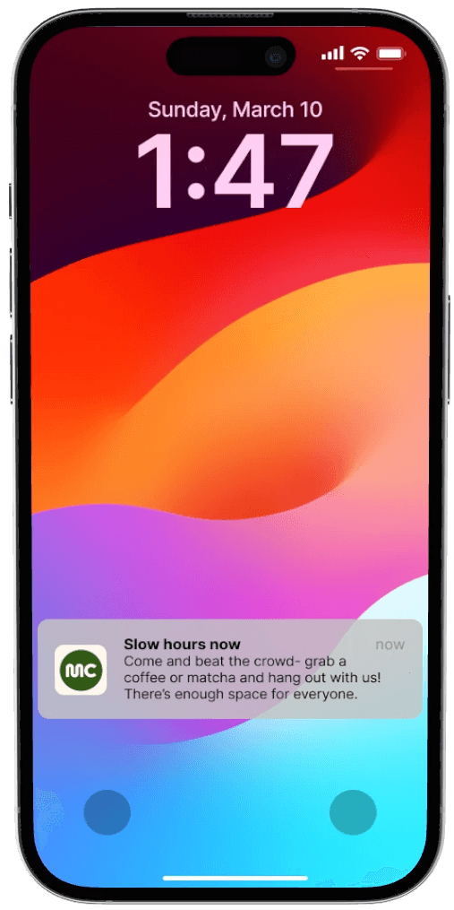
If a user gave Motoring Coffee their email or phone number, they would receive notifications whenever there were slow hours in the store. This way, users don't have to wait for a seat to open up, or tables if they wanted to catch up on some work or reading.
"Slow Hours" notification
If a user gave Motoring Coffee their email or phone number, they would receive notifications whenever there were slow hours in the store. This way, users don't have to wait for a seat to open up, or tables if they wanted to catch up on some work or reading.
"Slow Hours" notification
If a user gave Motoring Coffee their email or phone number, they would receive notifications whenever there were slow hours in the store. This way, users don't have to wait for a seat to open up, or tables if they wanted to catch up on some work or reading.
"Slow Hours" notification
If a user gave Motoring Coffee their email or phone number, they would receive notifications whenever there were slow hours in the store. This way, users don't have to wait for a seat to open up, or tables if they wanted to catch up on some work or reading.


Reflections and takeaways
Reflections and takeaways
Reflections and takeaways
Reflections and takeaways
If I had more time, I would have gotten design and usability feedback from non-designers. In class we were taught user testing in theory, but practical application wasn’t feasible due to time constraints.
If I had more time, I would have gotten design and usability feedback from non-designers. In class we were taught user testing in theory, but practical application wasn’t feasible due to time constraints.
If I had more time, I would have gotten design and usability feedback from non-designers. In class we were taught user testing in theory, but practical application wasn’t feasible due to time constraints.
Openness to feedback
I spent most of the class being critiqued by the same group of people, so whenever we had the opportunity to be critiqued by the professor in front of the class, I always volunteered first. The new eyes allowed for me to make more notable changes, and consider things that I wouldn’t have myself.
Build on what was already there
As a relatively new coffee shop, Motoring Coffee’s website didn’t contain much information. It was tempting to want to do an entire overhaul of their brand and image, but it wasn’t something that would be practical in real practice. I built upon the existing website and brand identities they had, and built out a design system by recreating their existing products and media.


